
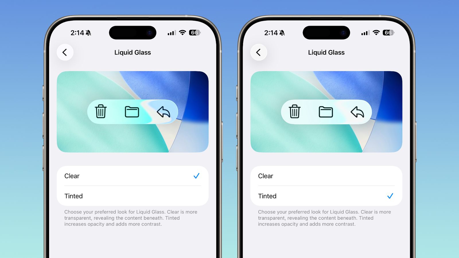
Apple is addressing user concerns about its new “Liquid Glass” interface in iOS 26, following criticism that the design’s heavy transparency has affected usability. The company has introduced a new “Tinted” option in the iOS 26.1 beta, allowing users to adjust opacity and contrast for improved readability.
The Liquid Glass UI, one of iOS 26’s most distinctive visual changes, has divided users since its debut. While some praised its modern aesthetic, others found the see-through elements made text and buttons difficult to read. “Its heavy reliance on transparency has drawn criticism, with some users finding it impedes usability and even draws comparisons to the Windows Vista Aero aesthetic,” one early reviewer wrote.
Apple initially reduced the level of transparency before the final release of iOS 26, but the company has now gone further by offering a direct fix. The new “Tinted” option, found under Settings > Display & Brightness, replaces the uniform design with a choice between the default “Clear” effect and a more opaque “Tinted” interface.
The “Tinted” setting increases contrast and reduces background visibility, making interface elements stand out more clearly against variable wallpapers. According to early testers, the change significantly improves readability, especially in bright or visually complex backgrounds.
The same toggle is now available in iPadOS and macOS Tahoe 26.1 betas, signaling Apple’s intent to standardize the adjustment across its platforms. The company has not confirmed when iOS 26.1 will be publicly released, but the update appears aimed at striking a balance between design flair and practical usability.
Source: MacRumors